
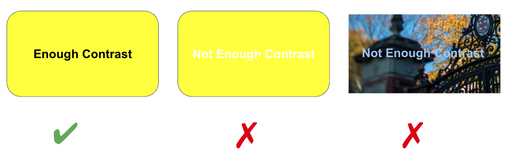
Poor color choices can make your content less usable for everyone, especially individuals who are visually impaired or color blind.
General rules for using color
- Provide sufficient contrast between the foreground text information and background color.
- Use color in combination with text-based information - color shouldn't be the only way to convey meaning.
Contrast
When choosing colors to present text information the foreground to background contrast ratio should be a minimum of:
- 4.5:1 for regular text
- 3:1 for 18 point font and larger, or 14 point font and bold
How do you know what ratio you are using? Test your colors in a contrast checker like the WebAIM Contrast Checker.
Conveying Information with Color
Color should not be used as the sole means of providing information. Individuals who are blind, visually impaired, or have certain types of color-blindness may not be able to discern what information is being communicated by color alone.
If color is used as the only means of providing information, then this requires that a person must discern between the color differences in order to understand the information. For example, the pie chart below lacks number labels that identify the size of each slice. This forces people to rely on interpreting the colors based on the legend.
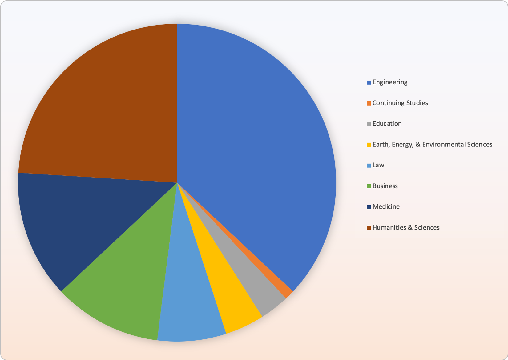
For some individuals, particularly those who have difficulty perceiving certain colors, this can be about as useful as having the same pie chart displayed in all grayscale.

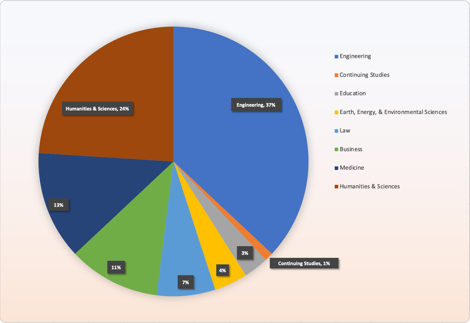
Combining color with additional information can improve comprehension for all individuals. In the following pie chart, labels are included that identify the data value and the category name on the chart in addition to displaying a legend. This results in a combination of both color and data to present information to the user.